US Census Visualization
Background
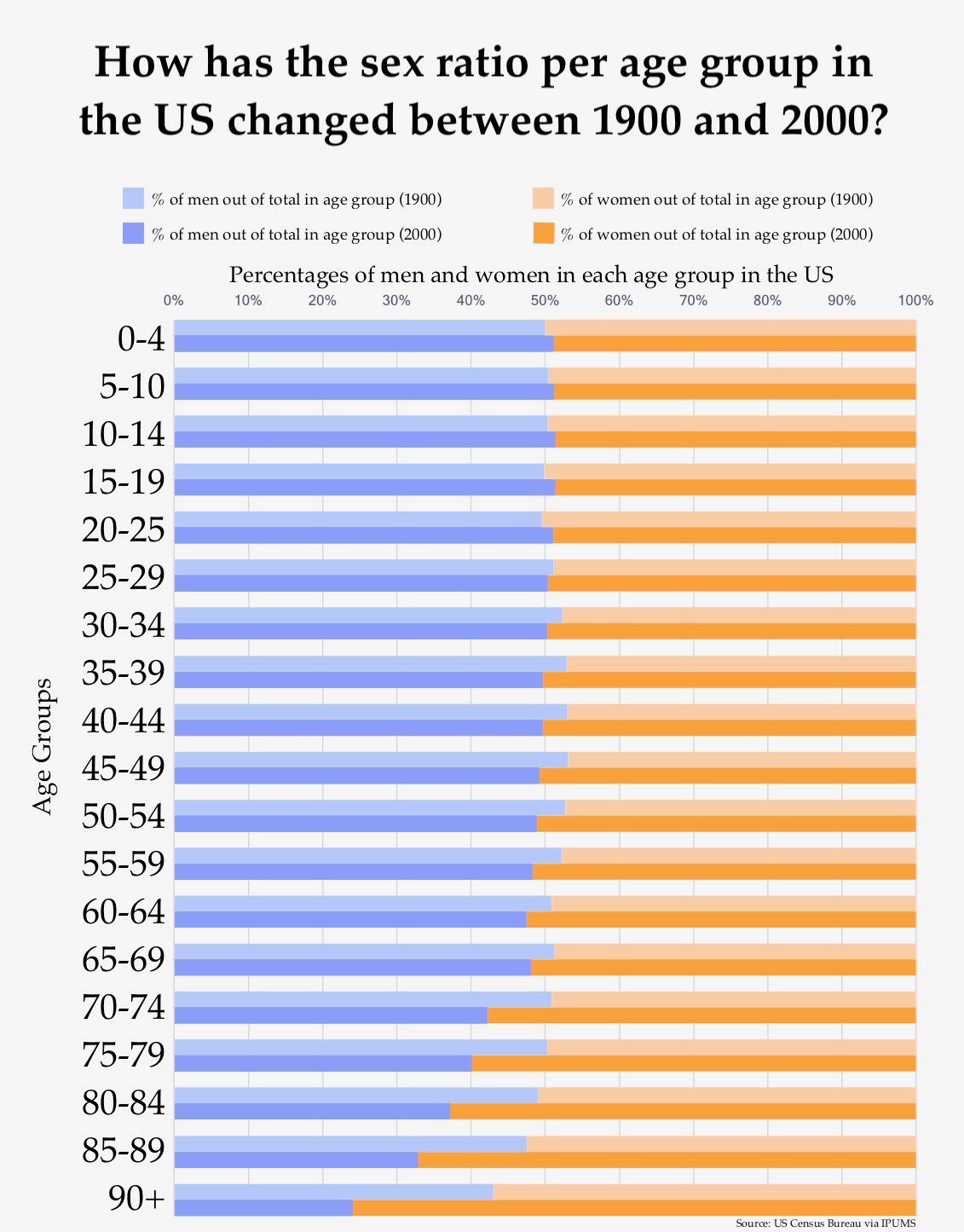
CSE 442 Project
Chart made in Excel
Visualization based on US census data between 1900 and 2000.
Design Rationale
I wanted to highlight this general trend, so I decided to use a clustered bar chart, with bars for both centuries per age group adjacent to one another. This would allow the viewer to easily compare the ratios between each century. Bars for each age group were spaced out for clarity so that it wouldn't be confusing which two bars represented which age groups. I wanted to use the percentages instead of the total population to also make it easier to see the differences between each century. I made the colors for 2000 darker because I wanted it to be the main focus because viewers would probably identify more with the more recent 2000 data. They would see this chart as comparing the present to the past. I put the 1900 bar on top of the 2000 because most people read things from top to bottom, so hopefully the reader would associate the top bar with the first year we are comparing, 1900. I decided to omit the actual percentages because it would make the chart too cluttered, and the general trends I wanted to highlight can already be seen with just the bars.
The main thing I wanted to highlight was that the decrease in percentages of older men is greater in 2000 than in 1900. Some smaller trends are also still visible on the chart, like how in 1900, the percentages of men starts to increase peaking at less than 5% around 45-49, and then decreases. Even though I could've made these smaller trends more visible if I made my chart longer lengthwise, I decided not to because the main focus of the chart is where the blue and pink bars meet, and if the chart too wide, the distance between the listed age groups and the meeting point would be too wide, making it harder to quickly see which age group you were looking at.
One fact that my chart doesn't show is that the number of people decreases as the age group increases because I made each bar the same length instead of proportional to the number of people per age group. I did this so that the ratios could be visually be compared between each age group. I believe this trade off is worth it because knowing that the number of people decreases as age group increases isn't important to understanding the general trend I wanted to highlight. Also, I didn't think my chart would mislead the viewer to think that the number of people in each age group is exactly the same because that would be very unlikely. Also, most people know that the US population has always been increasing and people start dying the older they get, so it would make sense that there are more younger people than older people.
Lessons Learned
This was the first visualization I made in class before I knew how to use Tableau. One thing I would've done differently is I would've made two separate bar charts for both centuries and put them side by side, instead of having the bar for 1900 right above 2000, to make it easier to compare both centuries.